Training: Excel Chart 2
Created on 2010-04-16 by Grigori Baghdasaryan
Switzernet
Format Category Axis Major Gridlines
Format Value Axis Major Gridlines
Format Data series: (For mobiles)
Format Data series: (For landlines)
Format Data Labels (for mobile)
Format Data Labels (for landlines)
Format Data series: (For mobiles from fixed network)
Format Data series: (For landlines from fixed network)
Changing Data series of Switzernet price
Introduction
The purpose of this exercise is to learn how to produce an excel chart and adapt its presentation to given format request. Each employee is going to create a chart during the training session and is going to use that produced chart as validation. He/She must chose different colors comparing with those used in the training session (not same used in the chart) while he/she follow the training session, in order to validate his document.
Requirements
Before you start, make sure you followed the training session: http://switzernet.com/2/support/100813-excel-chart-training/
Training session
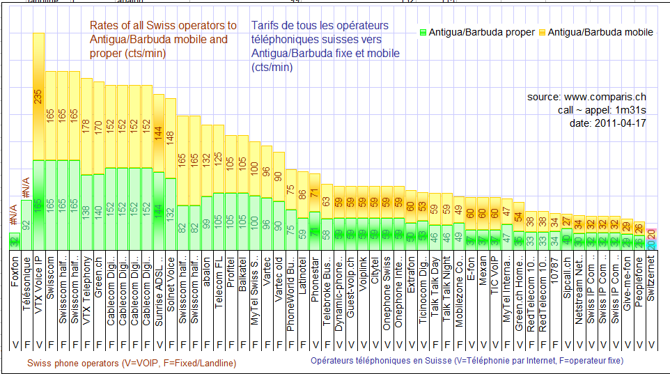
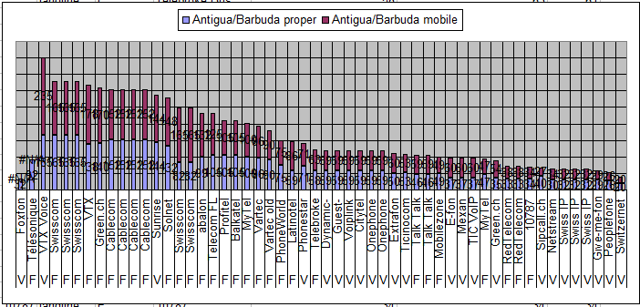
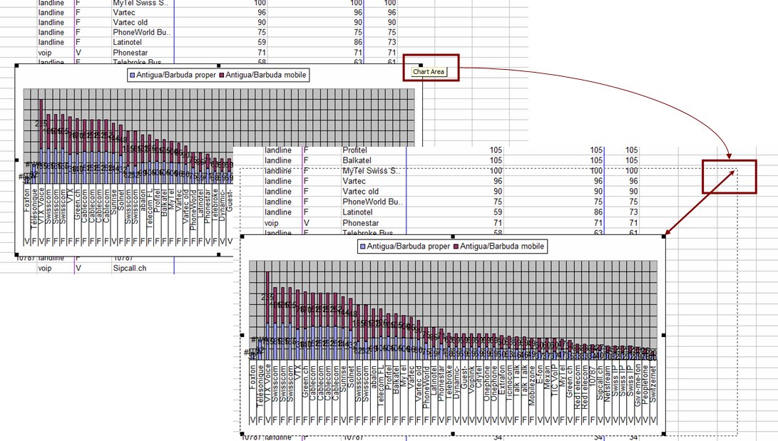
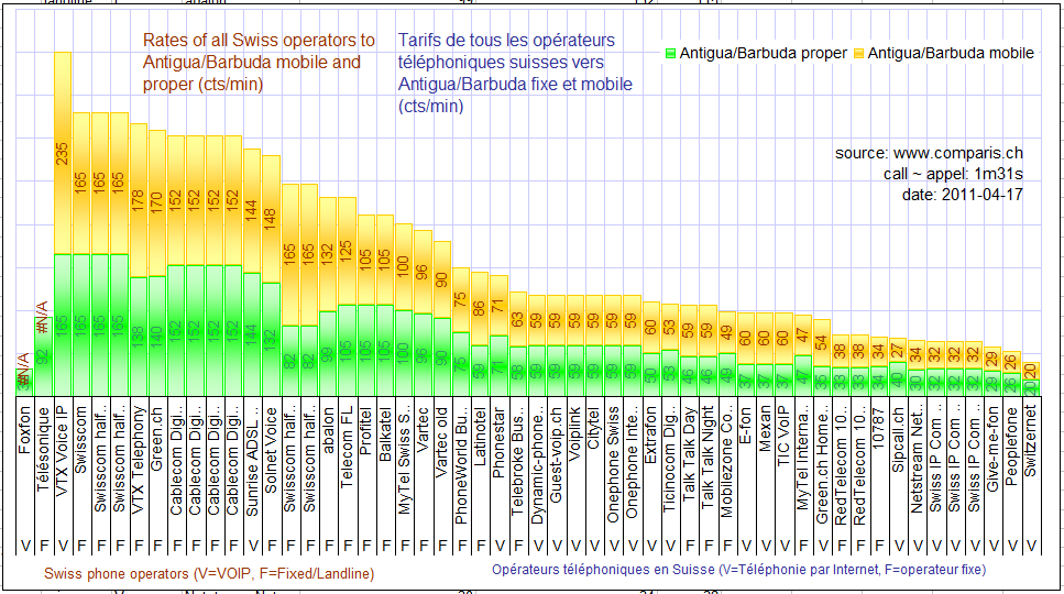
The final result that must be reached is :
Save the following Excel file in your PC: [xls].
Save the data in the Excel file and click on icon ![]() in order to
construct a chart:
in order to
construct a chart:
Choose Column -> Stacked Column ->click on Next
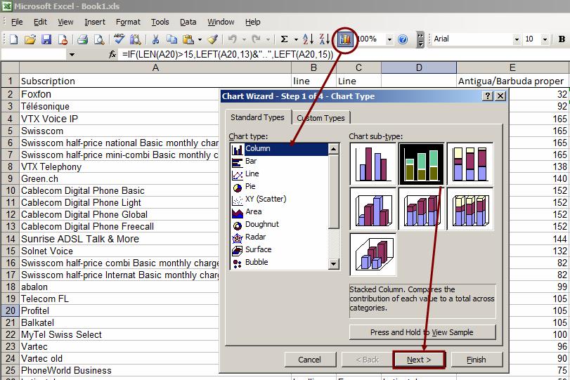
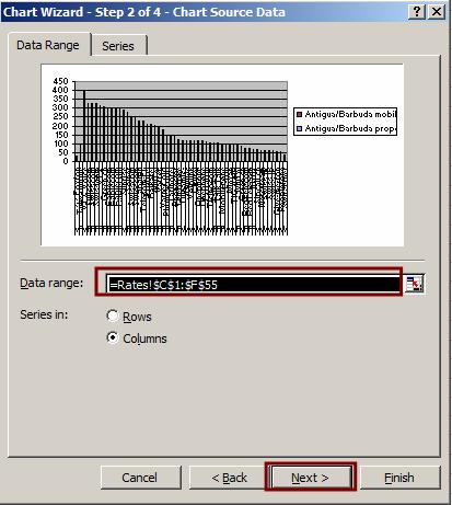
For Data Range write =Rates!$C$1:$F$55 , click on next
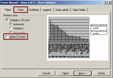
Go to Axes tab, and remove the checkbox for “Value (Y) axes”
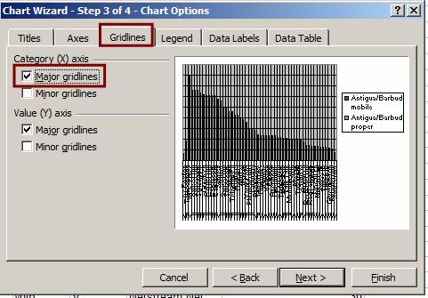
Go to Gridlines tab and select the checkbox for Category (X) axis Major gridlines
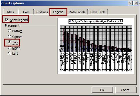
Go to Legend and select the checkbox for “Show legend”, and select option “Top” .
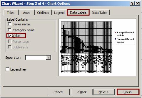
Go to Data Labels and select the checkbox for “Value” .
Click on Finish
You will get following chart
Encrease the size of the chart by clicking on the right top corner of the chart and moving your mouse
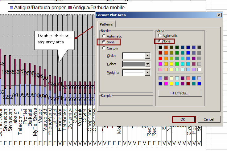
Format Plot Area
Double click on grey area, and format the Plot Area
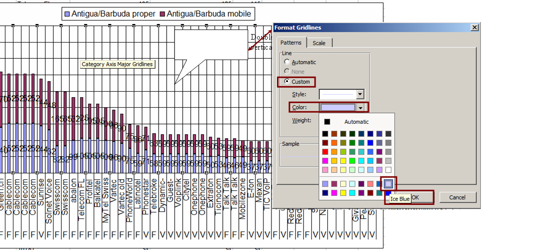
Format Category Axis Major Gridlines
Double-click on any vertical black line , choose Custom, and for color choose Ice blue, click OK
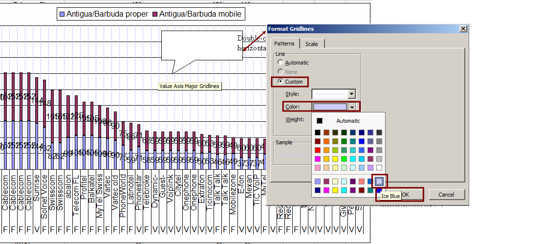
Format Value Axis Major Gridlines
Double-click on any horizontal black line , choose Custom, and for color choose Ice blue, click OK
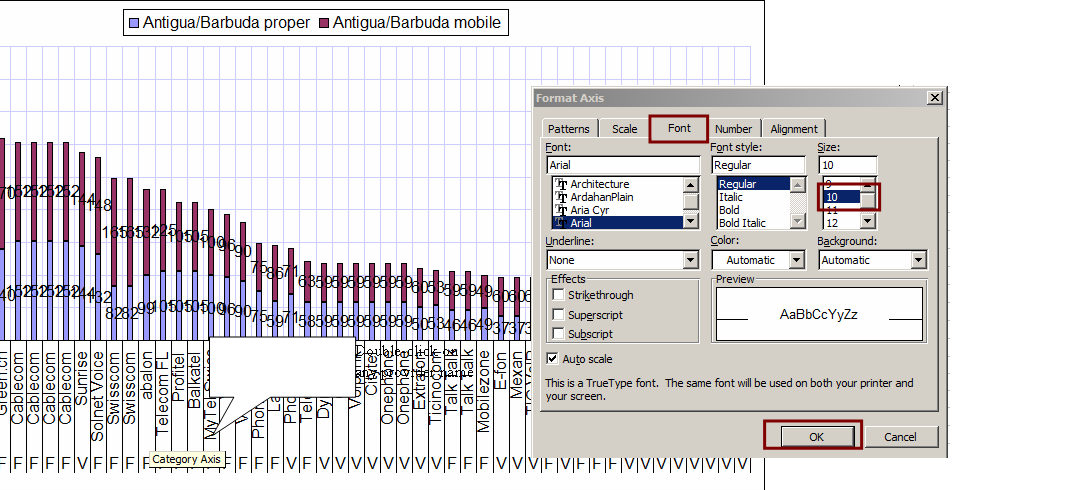
Format Category Axis
Double click on any provider name, go to Font, select size 10, click OK
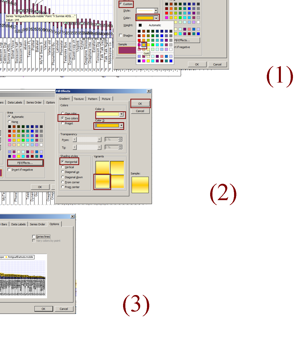
Format Data series: (For mobiles)
Double click on any brown area (but not number) .
(1) For border choose Custom , Color=Gold, Weight = dashed
(2) For area click on fill Effects, select “two colors”. Color 1 = Light Yellow. Color 2 = Gold . Sharing styles = Horizontal , for Variant chooe the bottom left corner one.
Click OK (for fill effects only )
(3)Go to Options , choose Overlap =100 , Gap width = 8
Clicl OK
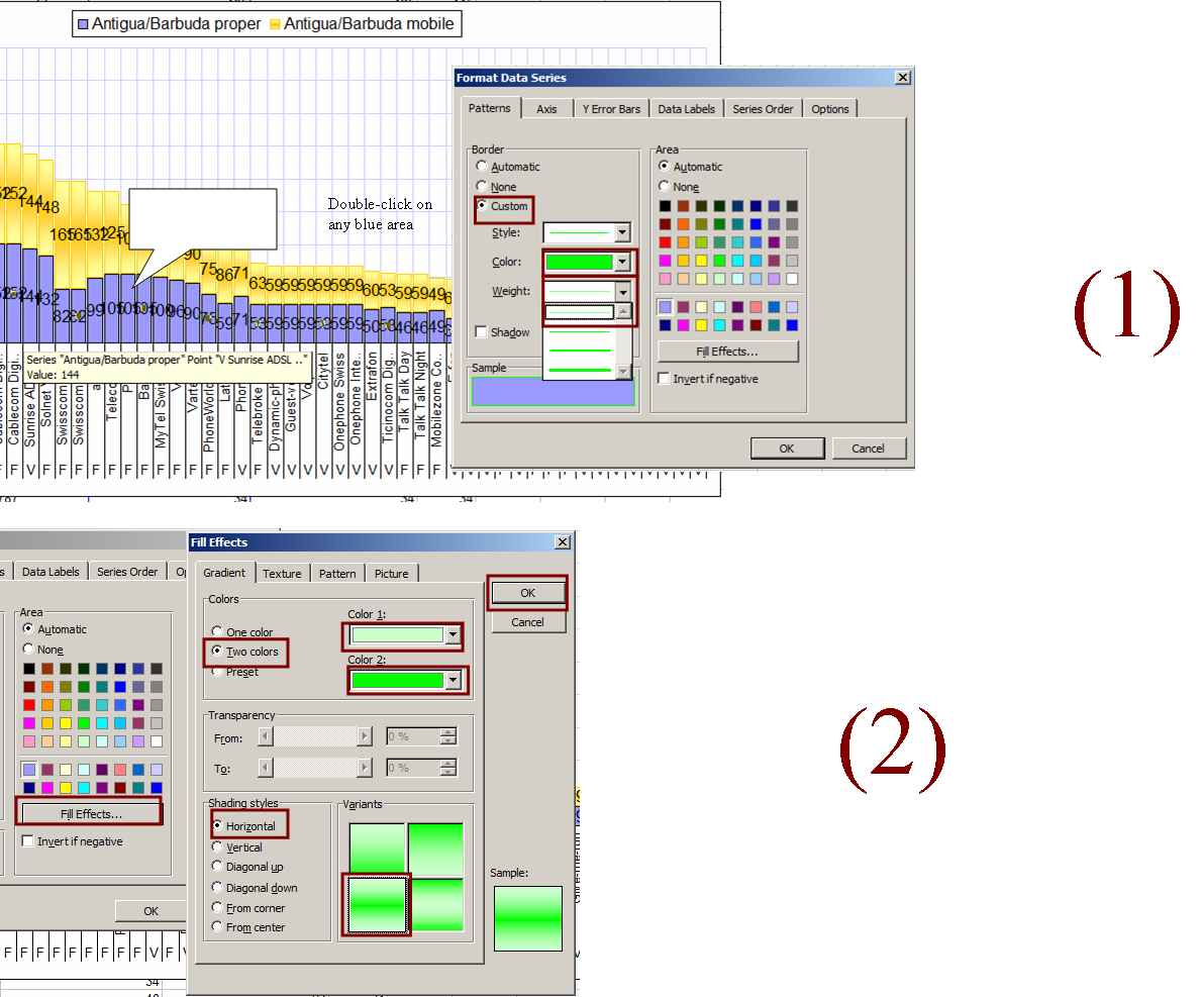
Format Data series: (For landlines)
Double click on any blue area (but not number) .
(1) For border, choose Custom , Color=Bright Green, Weight = dashed
(2) For area, click on fill Effects, select “two colors”. Color 1 = Light Green. Color 2 = Bright Green . Sharing styles = Horizontal , for Variant chooe the bottom left corner one.
Click OK (for fill effects )
Click OK (for format data series)
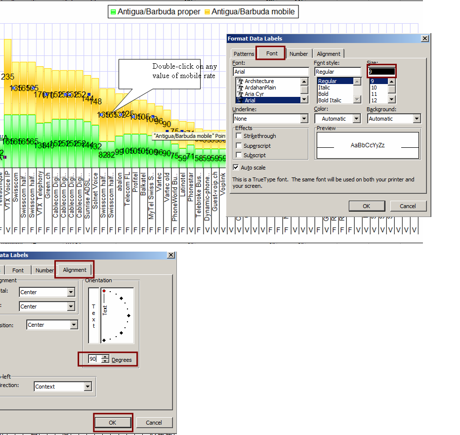
Format Data Labels (for mobile)
Double click on any value of mobile rates.
On Font tab select Size =9 , Color=brown
On Allignment tab for Orientation write 90 degrees
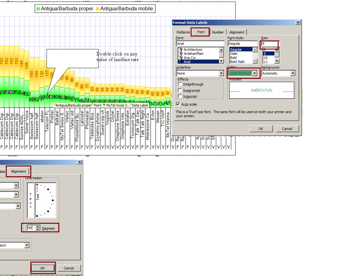
Format Data Labels (for landlines)
Double click on any value of local rates.
On Font tab select Size =9 , Color=brown
On Allignment tab for Orientation write 90 degrees
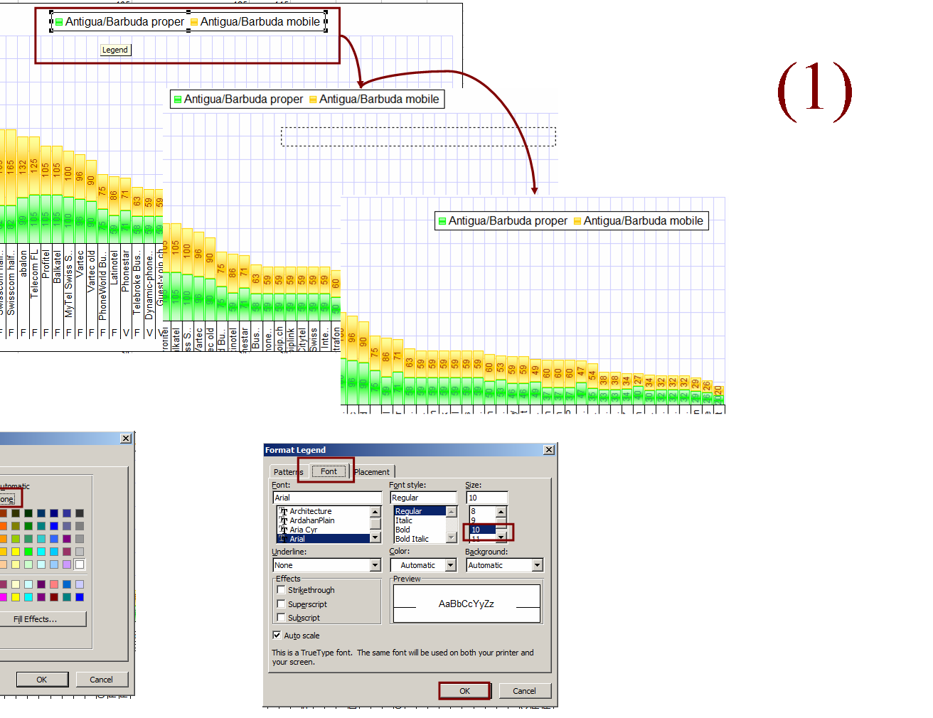
Format the legend
(1) Move the legend from top to left top corner.
Double click on legend
(2) In Pattern tab for border choose “None” , ffor area choose “None)
(3) In Font tab for Size choose “10”
Click OK
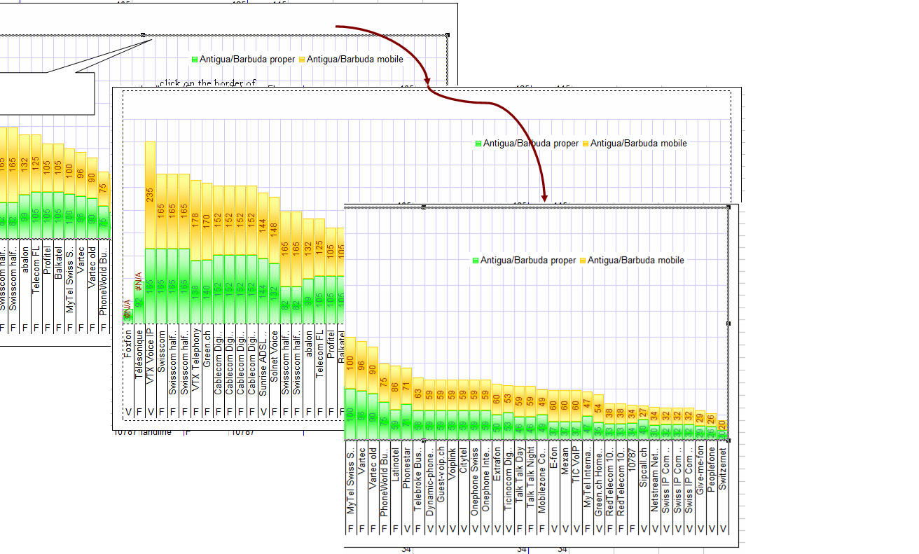
As the legend area is now free , encrease the plot area:
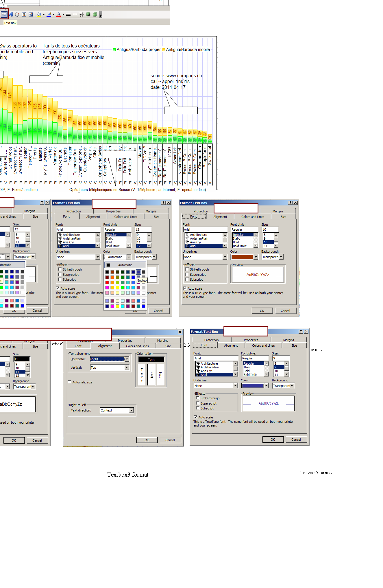
Adding text boxes
Add 5 text boxes:
Click on “Add text box “ from the drawing panel:
Textbox 1 - on english : Rates of all Swiss operators to Antigua/Barbuda mobile and proper (cts/min)
Color=brown, size =12
Textbox 2 - on french : Rates of all Swiss operators to Antigua/Barbuda mobile and proper (cts/min)
Color=indigo, size =12
Textbox 3 - source: www.comparis.ch call ~ appel: 1m31s date: 2011-04-17
Color=automatic, size=11, text alignment, horizontal = right
Textbox 4 - Swiss phone operators (V=VOIP, F=Fixed/Landline)
Color=brown, size =10
Textbox 5 - Opérateurs téléphoniques en Suisse (V=Téléphonie par Internet, F=operateur fixe)
Color=indigo, size =10
The destination and the date must be changed accordingly
The result will look like :
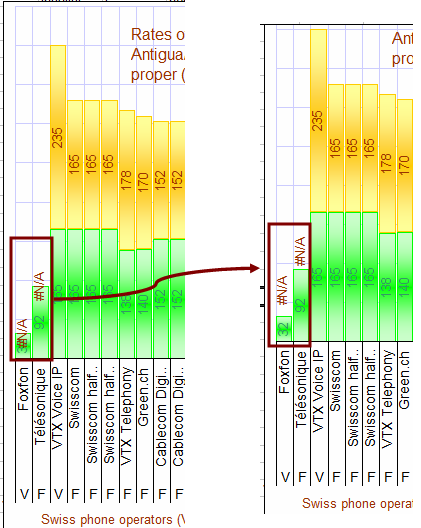
Making corrections
Although we are giving setting to group parameters , we are always able to make changes on separate values, or colors or text.
In this example the the mobile rate for first 2 operators is N/A and the word N/A is mixed with the landline rates. We need to to click on the value and move it up:
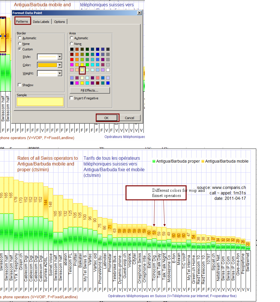
Format Data series: (For mobiles from fixed network)
For fixed networks the data point are must be one collored , without effect.
Double click on every fixnet data point one-by-one and in Patter tab for Area choose color light yellow
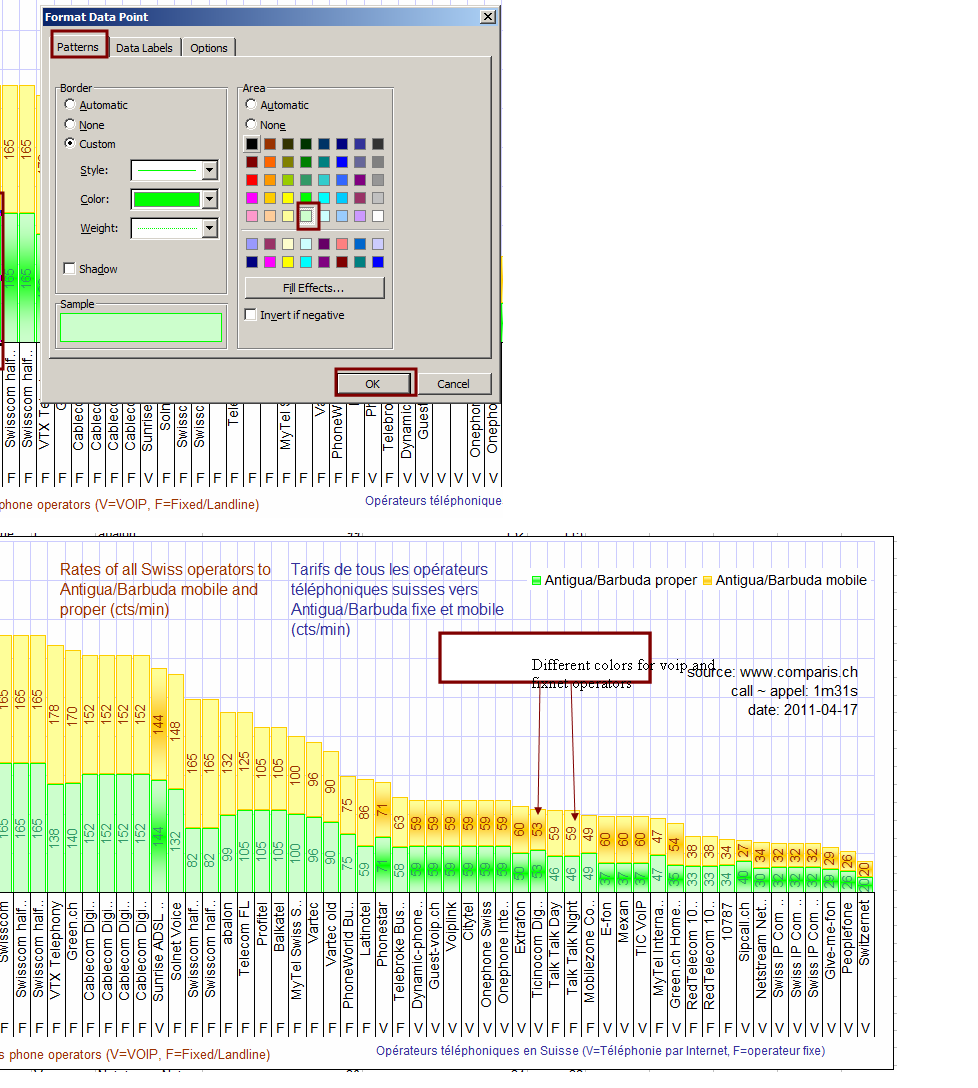
Format Data series: (For landlines from fixed network)
For fixed networks the data point are must be one collored , without effect.
Double click on every fixnet data point one-by-one and in Patter tab for Area choose color light yellow
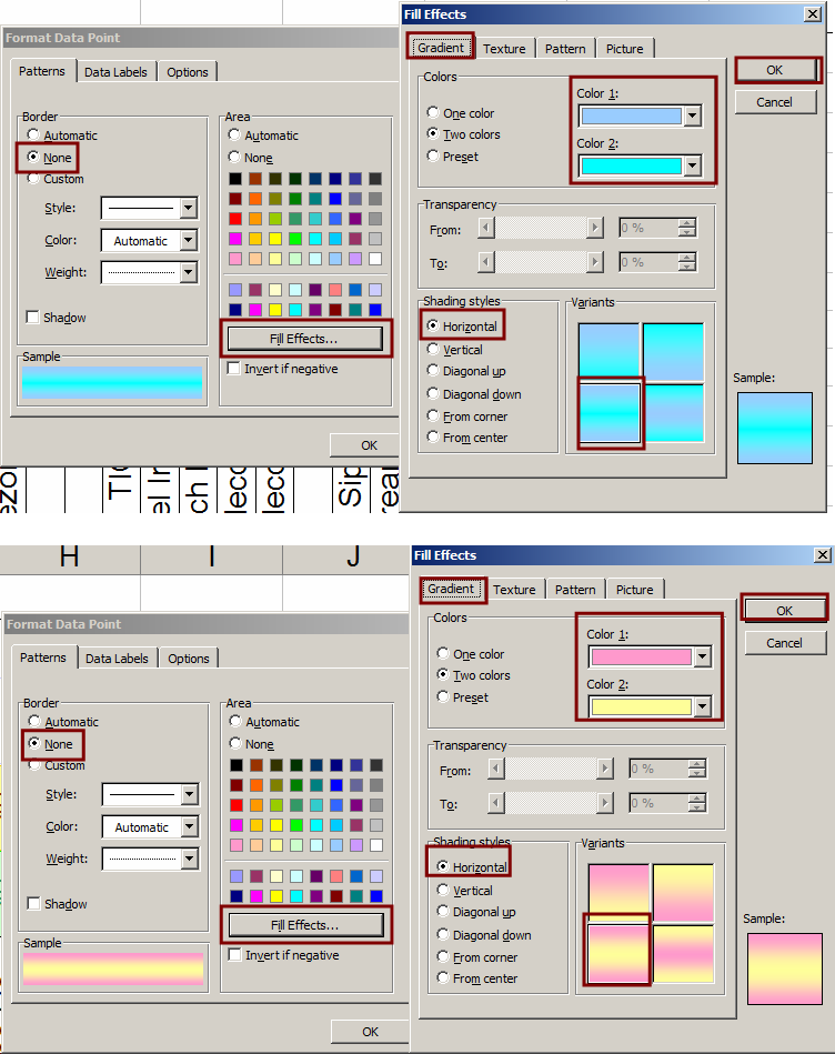
Changing Data series of Switzernet price
We need to change the data series of Switzernet’s price, to make it more viewable.
For landlines choose Color1= Pale Blue, Color2 =Torquoise, and the Variants of gradient the left bottom one
Fore mobiles choose choose Color1= Rose, Color2 =Lite Yellow, and the Variants of gradient the left bottom one
And the final result is :
Validation
To validate this training session, click on the chart, then copy it (Ctrl+C). Open “Paint” software and copy the image in a new file (Ctrl+V). Save it in PNG format. Name it in the following format: yymmdd-name-chart-2.png. Where yymmdd is the current date, name is your family name. This png file must be uploaded on the training session web site, according to the guidelines.
Note: when the task has been assigned, you received a set of colors to be used during creation of the chart (instead of red and blue used in the training session above). Please make sure you used the colors that you received by email.
Références
Making Combination Charts on Two Axes http://www.computorcompanion.com/LPMArticle.asp?ID=211
Training sessions: http://www.unappel.ch/2/support/100722-training-employees/i/
Training: Excel Chart: http://switzernet.com/2/support/100813-excel-chart-training/
* * *